
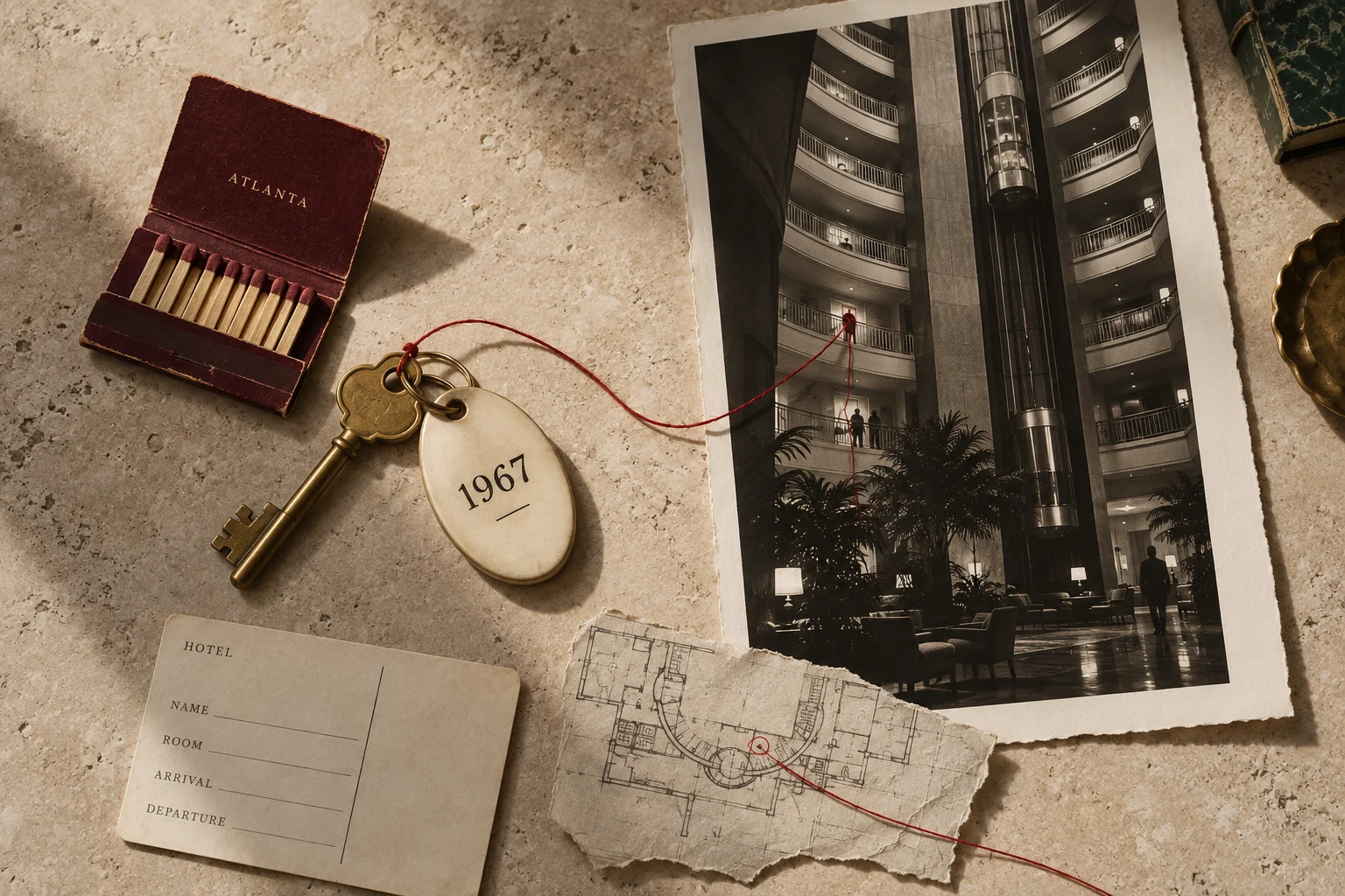
You step into a hotel and look up.
Balconies repeat into the distance. An elevator moves through the air. For a moment, arrival is an experience in itself.
Then you need to check in.
John Portman’s Hyatt Regency Atlanta opened in 1967. Its soaring atrium changed the expectations of a hotel lobby; Hyatt’s own history identifies the 22-story space as a defining moment for the brand.
The useful question for a website is what happens after that first moment of attention.
Can the person who has just entered find what they came for?
Choose an actual visitor
“Our customer” can be too vague to guide a walkthrough. Choose someone with a specific decision to make.
Perhaps a founder has asked a marketing director to assess your firm. Perhaps an operations leader is considering whether you can support several locations. Perhaps a prospective client has been referred but knows only your name.
Each person arrives with a different amount of context. Write down what they know, what they need to find out, and what would make them hesitate.
Then use the website without supplying the explanations your team usually supplies in conversation.
Follow the questions in the order they arise
What is this company responsible for? Does its work resemble the situation I am in? Is it capable of handling our level of complexity? Who would I be working with? What happens if I inquire?
A visitor may answer those questions through a project, a clear description, a person’s judgment, or a simple account of the process. They should not have to assemble the company from clues scattered across seven pages.
Watch where the walkthrough slows. A heading might be difficult to understand. The examples might show yesterday’s business. The navigation might describe internal departments rather than the customer’s needs.
Those are different conditions. A new visual identity will not resolve all of them by itself.
Keep walking after the form
Submit a test inquiry through the approved testing process. Who receives it? What does the person see next? How long does the reply take? Does the reply acknowledge what they asked?
Follow the first meeting, the proposal, and the handover into delivery. A website can promise unusually personal attention while the next three interactions make someone feel anonymous.
For a company with a strong executive team, this is a shared inspection. Marketing, sales, and operations should examine the same path. Each will see something the others cannot.
The visitor does not experience three departments. They experience one company.
Turn observations into the right brief
Record each difficulty with the evidence that revealed it. “A referred buyer could not find a comparable project” is more actionable than “the site feels dated.”
Decide what must be clarified before design: the offer, the audience, the proof, the inquiry process, or the delivery promise. Establish what the website itself must change and what another part of the business must support.
Then commission the redesign around that route.
The atrium can still be extraordinary. Give the person standing beneath it a clear way to begin.
Sources and context
Historical details are grounded in the sources below. Business interpretations are RUINE’s editorial analysis. The featured image is an original conceptual illustration, not a historical photograph or measured drawing.
Continue reading at The Desk, or begin with What is a brand brokerage?